


[et_pb_section fb_built=”1″ _builder_version=”3.22″][et_pb_row _builder_version=”3.25″ background_size=”initial” background_position=”top_left” background_repeat=”repeat”][et_pb_column type=”4_4″ _builder_version=”3.25″ custom_padding=”|||” custom_padding__hover=”|||”][et_pb_text _builder_version=”4.0.11″ background_size=”initial” background_position=”top_left” background_repeat=”repeat” custom_padding=”||12px|||” hover_enabled=”0″]
No matter what size your business is, a strong and considered Visual Identity is the key to making a lasting, positive impression on your audience.
“Design adds value faster than it adds costs.” – Joel Spolsky
Logo
Your brand’s fingerprint. The graphic design element of your brand needs to clearly represent your business your tone of voice while remaining as clear as possible and as simple as possible. A clever and impactful logo will be able to do just this. Designing a logo shouldn’t necessarily take long to create, but it should take a lot of consideration and iteration. You don’t know what’s best until you’ve exhausted your options! With a logo being so central to a brand’s visual identity, it’s the most important thing to get right the first time. It’s a lot more detrimental to brand recognition by changing a logo icon rather than a font or a photo style! We might be biased here at Advantage, but this is a very important aspect to consult a professional and passionate designer for. A truly custom and considered logo is the most valuable asset to your business (other than your passion!).
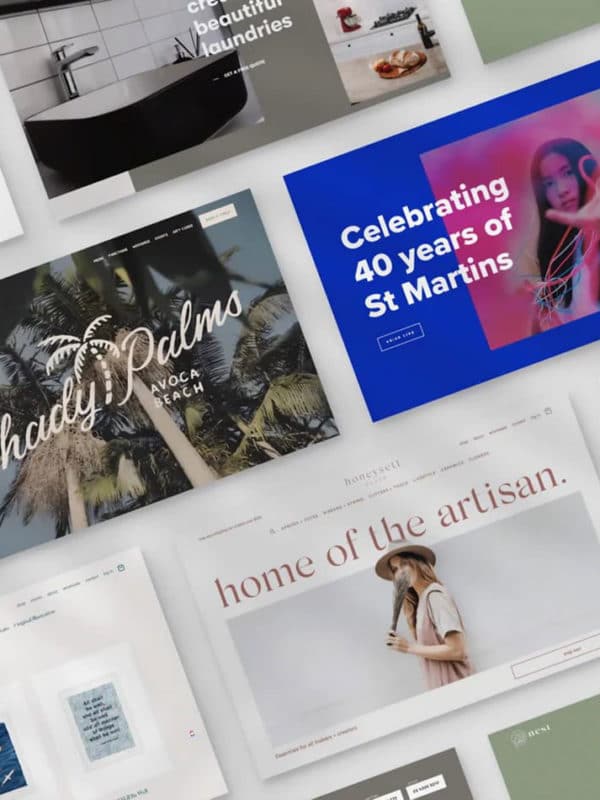
Photo Treatment
Almost every brand has elements of photography in its identity. Unconsciously, an audience can recognise the refined presentation of a brand that incorporates uniform photography style compared to a patchwork style of imagery. This is especially important in the age of Social Media Marketing. In a world bought and sold by imagery, consistent and deliberate photo choices can be the detail that takes your brand from amateur to professional.
Font Choices
The simple act of a font choice can have a major impact on your brand! Are you classic, refined and demure with a handsome Serif Font like Bodoni, clean and neutral like the ubiquitous Helvetica? Or lazy and want to match every Eastern Tea Shop in the Western Market with Papyrus?
[/et_pb_text][et_pb_code _builder_version=”4.0.5″][/et_pb_code][et_pb_text _builder_version=”4.0.11″ custom_padding=”16px|||||”]
While we might be getting a little melodramatic about this, truly, it is widely recognised the importance of having a font choice/s that conveys information clearly as well as continuing the tone of voice the rest of your branding has worked hard to present. You usually would like to have three parts to your brand’s type family. A Header font, a Body Text font, and a Secondary Emphasis font. They should complement each other and have a clear, consistent hierarchy in the text, giving the reader a straight down the line reading experience. Too many fonts and colours will only serve to confuse your audience and give an air of befuddlement for your business.
[/et_pb_text][et_pb_text _builder_version=”4.0.5″ custom_padding=”16px||17px|||”]
Colour Palette
Well, it’s 2020 now and we’ve all heard about the Psychology of Colour. And it’s still just as important today! In fact, with every industry now absolutely packed with competitors, having a modern yet timeless colour palette and handling is more important than ever. The Cadbury Purple and the Macca’s Red and Yellow are still standing to this day because people took the time to properly consider the impact and longevity of colour in the minds of the masses, and you should too!
Style Guide
Now you can have developed and nurtured a completely brilliant and totally unique brand identity, but it’s all for naught if you don’t maintain it! Even the smallest of businesses can sometimes lose sight of the importance of remaining consistent in your visual message but being diligent and staying true to your brand’s style can be made miles easier by creating a Style Guide. This is a document that keeps all the little rules and details, like the exact shades of your colour palette, key words and phrases, photography treatment, logo size requirements and minimums all in one, easy to refer to guide. These are especially important when you have multiple people creating assets for your business! A business with multiple moving parts always presents and performs better when a detailed and clear Style Guide is within reach.
When a brand has clearly ruminated on all these details of their visual identity, a strong and lasting impression is made on their audience and their community at large!
[/et_pb_text][/et_pb_column][/et_pb_row][/et_pb_section]