

Website Design Trends for 2018
Still current, but possibly on the way out
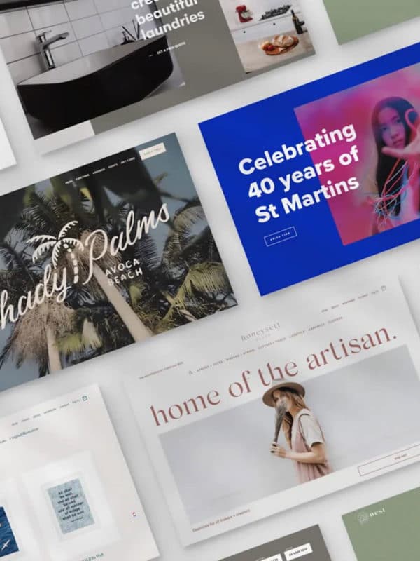
Web Design Trends for 2018
We are seeing these trends entering “mainstream” web design, but they have been here for a while
Shape Dividers: Diagonal lines, zig-zags, curves, chevrons and more. The horizontal line divider isn’t being thrown out, but the shape divider adds a little spice the the one-page website layout.
Gifs and Animation: Whether you pronounce it gif or gif (if you didn’t read that in two different ways, then you probably haven’t been around the design world for long) is beside the point, they’re coming back. Not your Clip Art or MSN animations mind you – clever, subtle movements in iconography or logos. Maybe calling it gif is an injustice, many of these are done with animated SVGs and JavaScript.
More depth: Flat elements and layouts have been leading UI design for a while now. Depth is coming back in the form of what’s being humbly labelled “semi-flat design” of “flat 2.0”. I don’t think we’ll see the return of the fully-fledged drop-shadow or bezel any time soon, though.
Fully-rounded corners: Not your 3px rounded corner to soften the edge, that is so 2012 – 2015, but your Spotify button-type corners. The flat, 90 degree edged cards are on the way out
Mega Menus
____
Both web and mobile design have been dominated by card-based UIs for several years now. Until recently, most of those cards were (mostly) sharp-edged and right-angled, exposing the geometry of their underlying divs in an almost modernist concern for the materials of web design.
That’s changed in a big, big way in 2017. Now, every app from Google Now to Twitter to Facebook boasts almost aggressively rounded corners on their cards, input boxes, profile avatars, and more.
____
Illustration
Asymmetric Layouts
Broken grid layouts
Loading animations: staggered, layered scrolling, entering animations
Maximilism: Not quite the antithetical to minimilism
____
For years now, it’s seemed like the most powerful and coveted bit of design feedback you could get was: “it’s clean.”
That was the design world in the era of minimalism. Deeply influenced by Dieter Rams’ principles of good design, as well as the influential essay on typography, “The Crystal Goblet,” visual designers have long sought to get out of users’ way by offering as few choices and visual distractions as possible.
And for a world where living within the digital was a new and rare experience, that choice made a lot of sense. We need to be eased into this strange new world.
But today, we have sites like the following — which, fair warning, could possibly cause seizures:
____
CSS Grid
https://webflow.com/blog/19-web-design-trends-for-2018