


[et_pb_section fb_built=”1″ fullwidth=”on” next_background_color=”#f7f7f7″ _builder_version=”3.0.106″ bottom_divider_style=”slant2″ bottom_divider_height=”103px”][et_pb_fullwidth_header title=”Graphic Design Trends For 2018″ subhead=”Some new, some here to stay” background_overlay_color=”rgba(0,0,0,0.44)” _builder_version=”3.2″ subhead_font=”||||||||” subhead_font_size=”23px” background_color=”rgba(255, 255, 255, 0)” background_image=”https://advantagemediagroup.com.au/wp-content/uploads/2018/01/pexels-photo-744789-Recovered.jpg” background_size=”initial” background_position=”bottom_center” custom_padding=”150px||150px|”][/et_pb_fullwidth_header][/et_pb_section][et_pb_section fb_built=”1″ _builder_version=”3.0.106″ background_color=”#f7f7f7″][et_pb_row _builder_version=”3.0.106″][et_pb_column type=”4_4″ _builder_version=”3.0.106″ parallax=”off” parallax_method=”on”][et_pb_text _builder_version=”3.0.106″ text_font=”||||||||”]
We’re already well into 2018, and have a solid grasp on the graphic design trends that 2018 both brings and maintains. With each year bigger than the last when it comes to the digital world, we’re seeing businesses try new things to get noticed. Tools like Photoshop are more readily available and the skills required to operate them are less than they once needed to be. Trends are influenced by umpteen number of sources, so it can be hard to identify them. Here are some that we are most interested in:
[/et_pb_text][/et_pb_column][/et_pb_row][/et_pb_section][et_pb_section fb_built=”1″ disabled_on=”off|off|off” admin_label=”Hero” _builder_version=”3.0.106″ custom_padding=”0px|0px|0px|0px” animation_style=”zoom” animation_intensity_zoom=”4%”][et_pb_row make_fullwidth=”on” use_custom_gutter=”on” gutter_width=”1″ custom_padding=”0px||0px|” make_equal=”on” bg_img_2=”https://advantagemediagroup.com.au/wp-content/uploads/2018/04/Double-exposure-photography.jpg” padding_top_1=”100px” padding_right_1=”8%” padding_bottom_1=”100px” padding_left_1=”8%” _builder_version=”3.0.106″ background_color=”#ffffff” background_position=”top_left” background_repeat=”repeat” background_blend=”multiply” animation_style=”slide” animation_direction=”top” animation_intensity_slide=”3%”][et_pb_column type=”1_2″ _builder_version=”3.0.47″ padding_bottom=”100px” padding_left=”8%” padding_right=”8%” padding_top=”100px” parallax=”off” parallax_method=”on”][et_pb_text _builder_version=”3.0.106″ text_font=”||||||||” header_font=”Montserrat|700||on|||||” header_text_color=”#f7f7f7″ header_font_size=”60px” header_font_size_last_edited=”off|desktop” header_line_height=”1.3em” background_size=”initial” background_position=”top_left” background_repeat=”repeat” custom_margin=”||40px|” animation_style=”fade” locked=”off”]
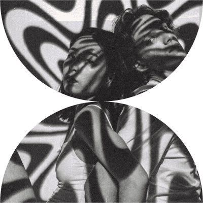
Double Exposure
[/et_pb_text][et_pb_text _builder_version=”3.0.106″ text_font=”||||||||” text_text_color=”#353740″ text_line_height=”1.8em” header_font=”||||||||” background_size=”initial” background_position=”top_left” background_repeat=”repeat” custom_margin=”||50px|” animation_style=”slide” animation_direction=”top” animation_intensity_slide=”17%” locked=”off”]
Typically speaking, double exposure is a technique dating back to the roots of photography. Literally referring to the process of exposing the film twice, which places one captured scene over another. Now in the digital age, it refers to a Photoshop technique where the contents (usually some scenery) of one photo are contained within the silhouette of another object, like a person or an animal. This is just one example, and it can be used with typography and all sorts of backgrounds.
[/et_pb_text][/et_pb_column][et_pb_column type=”1_2″ _builder_version=”3.0.47″ bg_img=”https://advantagemediagroup.com.au/wp-content/uploads/2018/04/Double-exposure-photography.jpg” parallax=”off” parallax_method=”on”][et_pb_divider show_divider=”off” _builder_version=”3.2″ custom_margin=”|||” custom_padding=”150px||150px|”][/et_pb_divider][/et_pb_column][/et_pb_row][et_pb_row make_fullwidth=”on” use_custom_gutter=”on” gutter_width=”1″ custom_padding=”0px||0px|” make_equal=”on” background_color_2=”#333″ padding_top_1=”100px” padding_top_2=”100px” padding_right_1=”8%” padding_bottom_1=”100px” padding_bottom_2=”100px” padding_left_1=”8%” _builder_version=”3.0.106″ background_color=”#ffffff” background_position=”top_left” background_repeat=”repeat” background_blend=”multiply” animation_style=”slide” animation_direction=”top” animation_intensity_slide=”3%”][et_pb_column type=”1_2″ _builder_version=”3.0.47″ padding_bottom=”100px” padding_left=”8%” padding_right=”8%” padding_top=”100px” parallax=”off” parallax_method=”on”][et_pb_text _builder_version=”3.0.106″ text_font=”||||||||” header_font=”Montserrat|700||on|||||” header_text_color=”#f7f7f7″ header_font_size=”60px” header_font_size_last_edited=”off|desktop” header_line_height=”1.3em” background_size=”initial” background_position=”top_left” background_repeat=”repeat” custom_margin=”||40px|” animation_style=”fade” locked=”off”]
Negative Space
[/et_pb_text][et_pb_text _builder_version=”3.0.106″ text_font=”||||||||” text_text_color=”#353740″ text_line_height=”1.8em” header_font=”||||||||” background_size=”initial” background_position=”top_left” background_repeat=”repeat” custom_margin=”||50px|” animation_style=”slide” animation_direction=”top” animation_intensity_slide=”17%” locked=”off”]
Psychology drives the use of intentional minimalism and white-space, and with concerns for ease-of-use and mobile responsiveness only increasing I don’t think that the “less is more” approach is going anywhere anytime soon. I just think that people have the tools, insight and abilities to be highly intentional about used space. Clever use of colours, patterns, illustrations, photos and typography can be used harmoniously in such a way as to still be classified as minimal.
[/et_pb_text][/et_pb_column][et_pb_column type=”1_2″ _builder_version=”3.0.47″ padding_bottom=”100px” padding_top=”100px” background_color=”#333″ parallax=”off” parallax_method=”on”][et_pb_image src=”https://advantagemediagroup.com.au/wp-content/uploads/2018/04/Empty-space-logo.svg” show_bottom_space=”off” align=”center” _builder_version=”3.0.106″ max_width=”17%” module_alignment=”center” custom_padding=”64px|||” custom_padding_last_edited=”on|desktop” filter_saturate=”0%” filter_brightness=”200%” filter_contrast=”200%”][/et_pb_image][/et_pb_column][/et_pb_row][et_pb_row make_fullwidth=”on” use_custom_gutter=”on” gutter_width=”1″ custom_padding=”0px||0px|” make_equal=”on” background_color_2=”#333333″ bg_img_2=”https://advantagemediagroup.com.au/wp-content/uploads/2018/04/Advantage-Media-Group-AdWords.jpg” padding_top_1=”100px” padding_top_2=”100px” padding_right_1=”8%” padding_bottom_1=”100px” padding_bottom_2=”100px” padding_left_1=”8%” background_size_2=”cover” background_position_2=”top_center” _builder_version=”3.0.106″ background_color=”#ffffff” background_position=”top_left” background_repeat=”repeat” background_blend=”multiply” animation_style=”slide” animation_direction=”top” animation_intensity_slide=”3%”][et_pb_column type=”1_2″ _builder_version=”3.0.47″ padding_bottom=”100px” padding_left=”8%” padding_right=”8%” padding_top=”100px” parallax=”off” parallax_method=”on”][et_pb_text _builder_version=”3.0.106″ text_font=”||||||||” header_font=”Montserrat|700||on|||||” header_text_color=”#f7f7f7″ header_font_size=”60px” header_font_size_last_edited=”off|desktop” header_line_height=”1.3em” header_2_font=”||||||||” header_2_font_size_last_edited=”on|phone” header_3_font=”||||||||” background_size=”initial” background_position=”top_left” background_repeat=”repeat” custom_margin=”||40px|” animation_style=”fade” locked=”off”]
Cropped Typography
[/et_pb_text][et_pb_text _builder_version=”3.0.106″ text_font=”||||||||” text_text_color=”#353740″ text_line_height=”1.8em” header_font=”||||||||” background_size=”initial” background_position=”top_left” background_repeat=”repeat” custom_margin=”||50px|” animation_style=”slide” animation_direction=”top” animation_intensity_slide=”17%” locked=”off”]
The technique referred to doesn’t officially have a name, but it’s the process of cutting off just a portion of the letters in a text + image piece. Usually mixed with deep-etched objects, such as that of a mountain, it’s designed to give depth and a new way for typography and imagery to interact. The text is generally cropped so that it is still largely readable, or sometimes even to the extreme where the rest of the word is assumed – the mind is clever that way.
[/et_pb_text][/et_pb_column][et_pb_column type=”1_2″ _builder_version=”3.0.47″ padding_bottom=”100px” padding_top=”100px” bg_img=”https://advantagemediagroup.com.au/wp-content/uploads/2018/04/Advantage-Media-Group-AdWords.jpg” background_color=”#333333″ parallax=”off” parallax_method=”on” background_size=”cover” background_position=”top_center”][et_pb_divider show_divider=”off” _builder_version=”3.2″ custom_margin=”|||” custom_padding=”150px||150px|” custom_padding_phone=”20px||20px||true” custom_padding_last_edited=”on|phone”][/et_pb_divider][/et_pb_column][/et_pb_row][et_pb_row make_fullwidth=”on” use_custom_gutter=”on” gutter_width=”1″ custom_padding=”0px||0px|” make_equal=”on” background_color_1=”#fa0087″ padding_top_1=”100px” padding_top_2=”100px” padding_top_3=”100px” padding_right_1=”5%” padding_right_2=”5%” padding_right_3=”5%” padding_bottom_1=”100px” padding_bottom_2=”100px” padding_bottom_3=”100px” padding_left_1=”5%” padding_left_2=”5%” padding_left_3=”5%” background_size_2=”cover” background_position_2=”top_center” use_background_color_gradient_2=”off” background_color_gradient_start_2=”#7953ff” background_color_gradient_end_2=”#fa0087″ background_color_gradient_direction_2=”-90deg” _builder_version=”3.0.106″ background_color=”rgba(2,242,206,0.09)” background_position=”top_left” background_repeat=”repeat” background_blend=”multiply” animation_style=”slide” animation_direction=”top” animation_intensity_slide=”3%”][et_pb_column type=”1_3″ _builder_version=”3.0.47″ padding_bottom=”100px” padding_left=”5%” padding_right=”5%” padding_top=”100px” background_color=”#fa0087″ parallax=”off” parallax_method=”on”][et_pb_text _builder_version=”3.0.106″ text_font=”||||||||” header_font=”Montserrat|700||on|||||” header_text_color=”#f7f7f7″ header_font_size=”60px” header_font_size_last_edited=”off|desktop” header_line_height=”1.3em” header_2_font=”||||||||” header_2_text_color=”#ffffff” header_2_font_size=”40px” background_size=”initial” background_position=”top_left” background_repeat=”repeat” background_layout=”dark” custom_margin=”||40px|” animation_style=”fade” locked=”off”]
Bold, bright colours
[/et_pb_text][et_pb_text _builder_version=”3.0.106″ text_font=”||||||||” text_text_color=”#ffffff” text_line_height=”1.8em” header_font=”||||||||” background_size=”initial” background_position=”top_left” background_repeat=”repeat” custom_margin=”||50px|” animation_style=”slide” animation_direction=”top” animation_intensity_slide=”17%” locked=”off”]
I wouldn’t throw the pastels out just yet, however colour choice in design can now be riskier and more exciting than ever. Introducing the resurgence of the bold and the beautiful. Bright yellows, hot pinks, electric blues. The design wheel continues to turn, and an assortment of bright colours are peaking just above the horizon.
[/et_pb_text][et_pb_image src=”https://advantagemediagroup.com.au/wp-content/uploads/2018/05/yellow-mountain-bold-colours.svg” _builder_version=”3.2″ alt=”Design Trends”][/et_pb_image][/et_pb_column][et_pb_column type=”1_3″ _builder_version=”3.0.47″ padding_bottom=”100px” padding_left=”5%” padding_right=”5%” padding_top=”100px” parallax=”off” parallax_method=”on” background_size=”cover” background_position=”top_center” use_background_color_gradient=”off” background_color_gradient_start=”#7953ff” background_color_gradient_end=”#fa0087″ background_color_gradient_direction=”-90deg”][et_pb_text _builder_version=”3.0.106″ text_font=”||||||||” header_font=”Montserrat|700||on|||||” header_text_color=”#f7f7f7″ header_font_size=”60px” header_font_size_last_edited=”off|desktop” header_line_height=”1.3em” header_2_font=”||||||||” header_2_font_size=”40px” background_size=”initial” background_position=”top_left” background_repeat=”repeat” custom_margin=”||40px|” animation_style=”fade” locked=”off”]
Gradients
[/et_pb_text][et_pb_text _builder_version=”3.0.106″ text_font=”||||||||” text_line_height=”1.8em” header_font=”||||||||” background_size=”initial” background_position=”top_left” background_repeat=”repeat” custom_margin=”||50px|” animation_style=”slide” animation_direction=”top” animation_intensity_slide=”17%” locked=”off”]
Many people laughed at the new Instagram logo – who’s laughing now. We can now see that they were well ahead of the trend – or maybe they ushered it in. Whether you like the latest logo from Instagram or not, we are noticing some sleek gradients popping up. So subtle that you may not have even noticed them out and about. Gradients can still be applied very wrongly, but there is also room for a right way. Check out Asana’s (a great task management software that we use ourselves) logo, for example.
[/et_pb_text][et_pb_image src=”https://advantagemediagroup.com.au/wp-content/uploads/2018/04/gradient-logo-design-asana.png” align=”center” _builder_version=”3.2″ max_width=”44%” module_alignment=”center” alt=”ASana logo”][/et_pb_image][/et_pb_column][et_pb_column type=”1_3″ _builder_version=”3.0.47″ padding_bottom=”100px” padding_left=”5%” padding_right=”5%” padding_top=”100px” parallax=”off” parallax_method=”on”][et_pb_text _builder_version=”3.0.106″ text_font=”||||||||” text_font_size=”24px” header_font=”Montserrat|900||on|||||” header_2_font=”Montserrat|900||on|||||” header_2_text_color=”#000000″ header_2_font_size=”49px”]
Bold fonts
[/et_pb_text][et_pb_text _builder_version=”3.0.106″ text_font=”||||||||” text_line_height=”1.8em” header_font=”||||||||” background_size=”initial” background_position=”top_left” background_repeat=”repeat” custom_margin=”||50px|” animation_style=”slide” animation_direction=”top” animation_intensity_slide=”17%” locked=”off”]
Not just bold, but ultra-bold font weights are all the rage. Speaking in web terms it was rare (impossible?) to see fonts at a greater weight than 600, now we see up to 900. With increasing web browser support I’m sure we’ll see more and more. Never before has any one font had so much variation available! If an extra bold font can be considered web safe then it becomes guilt-free to use it across graphic and print mediums, from a branding consistency perspective.
- 100: Extra Light or Ultra Light
- 200: Light or Thin
- 300: Book or Demi
- 400: Normal or Regular
- 500: Medium
- 600: Semibold, Demibold
- 700: Bold
- 800: Black, Extra Bold or Heavy
- 900: Extra Black, Fat, Poster or Ultra Black
[/et_pb_text][/et_pb_column][/et_pb_row][et_pb_row make_fullwidth=”on” use_custom_gutter=”on” gutter_width=”1″ custom_padding=”0px||0px|” make_equal=”on” background_color_2=”#333333″ bg_img_2=”https://advantagemediagroup.com.au/wp-content/uploads/2018/04/80s-90s-palettes-patterns.jpg” padding_top_1=”100px” padding_top_2=”100px” padding_right_1=”8%” padding_bottom_1=”100px” padding_bottom_2=”100px” padding_left_1=”8%” parallax_2=”on” _builder_version=”3.0.106″ background_color=”#ffffff” background_position=”top_left” background_repeat=”repeat” background_blend=”multiply” animation_style=”slide” animation_direction=”top” animation_intensity_slide=”3%”][et_pb_column type=”1_2″ _builder_version=”3.0.47″ padding_bottom=”100px” padding_left=”8%” padding_right=”8%” padding_top=”100px” parallax=”off” parallax_method=”on”][et_pb_text _builder_version=”3.0.106″ text_font=”||||||||” header_font=”Montserrat|700||on|||||” header_text_color=”#f7f7f7″ header_font_size=”60px” header_font_size_last_edited=”off|desktop” header_line_height=”1.3em” background_size=”initial” background_position=”top_left” background_repeat=”repeat” custom_margin=”||40px|” animation_style=”fade” locked=”off”]
80s + 90s palettes and patterns
[/et_pb_text][et_pb_text _builder_version=”3.0.106″ text_font=”||||||||” text_text_color=”#353740″ text_line_height=”1.8em” header_font=”||||||||” background_size=”initial” background_position=”top_left” background_repeat=”repeat” custom_margin=”||50px|” animation_style=”slide” animation_direction=”top” animation_intensity_slide=”17%” locked=”off”]
Growing up in this period, I have distinct memories of not-so-good design trends. They are coming back in a good way, surprising to say. We often see parallel trends across graphic design, music and fashion, where 60s and 70s psychedelic and floral patterns have been kicking for a while now. With almost 40 years between us and 1980, it was only a matter of time before simple shape and line patterns jumped back on the scene. My only request is that we don’t bring back hairstyles and fashion from this era, please.
[/et_pb_text][/et_pb_column][et_pb_column type=”1_2″ _builder_version=”3.0.47″ padding_bottom=”100px” padding_top=”100px” bg_img=”https://advantagemediagroup.com.au/wp-content/uploads/2018/04/80s-90s-palettes-patterns.jpg” background_color=”#333333″ parallax=”on” parallax_method=”on”][/et_pb_column][/et_pb_row][/et_pb_section][et_pb_section fb_built=”1″ _builder_version=”3.0.106″ custom_padding=”0|0px|0|0px”][et_pb_row custom_padding=”100px||0|” padding_top_2=”100px” padding_bottom_2=”100px” parallax_2=”on” _builder_version=”3.0.106″ background_color=”#ffffff” background_position=”top_left” background_repeat=”repeat” background_blend=”multiply” animation_style=”slide” animation_direction=”top” animation_intensity_slide=”3%”][et_pb_column type=”4_4″ _builder_version=”3.0.47″ parallax=”off” parallax_method=”on”][et_pb_text ul_type=”circle” _builder_version=”3.0.106″ text_font=”||||||||” text_text_color=”#353740″ text_font_size=”17px” text_line_height=”1.8em” ul_font=”||||||||” ul_font_size=”17px” ul_line_height=”1.5em” header_font=”||||||||” background_size=”initial” background_position=”top_left” background_repeat=”repeat” custom_margin=”||50px|” animation_style=”slide” animation_direction=”top” animation_intensity_slide=”17%” locked=”off”]
We could go on, but I worry that by the time I finished the list that new trends would have surfaced. The number of hobbyist designers is greater than ever, so it has never been more important to make sure you work with a professional. To the everyday business owner, design may not seem like such a big deal; the subconscious mind of your clients’ begs to differ. There are a few truths to consider:
- Different demographics gel better with different design trends
- Objectively “bad” design is a surefire way to lose clients. Is there anything objective about design you may ask? Well, maybe not, but using a dark font on a dark image, rendering it unreadable, is probably a bad decision.
- Trends are temporary, some are safer than others. A design professional has the best chance of predicting which trends will remain abiding. Like painting your homes internal walls white, can one ever go wrong?
- A brand can be dynamic when concerning trends. In fact we’d argue that it should be. If you look at most of the biggest companies in the world you will notice that they all adapt to the trends around them.
It can be a headache, but don’t let it be! We’re here to help. If you need graphic design services then look no further.
[/et_pb_text][/et_pb_column][/et_pb_row][/et_pb_section]